Thumbnails that get the click · Lesson 1
Why the thumbnail decides everything
On YouTube, the thumbnail is the single biggest lever you control over whether anyone watches. Here's the data, and what it means for how you work.
You just spent twelve hours on a video. Then, five minutes before publishing, you screenshot a random frame, slap it on, and hit upload. If that’s the workflow, you’re quietly throwing away most of the audience the video could have reached, before a single person presses play.
That’s not a motivational exaggeration. It’s how the platform is built.
The click is the gate
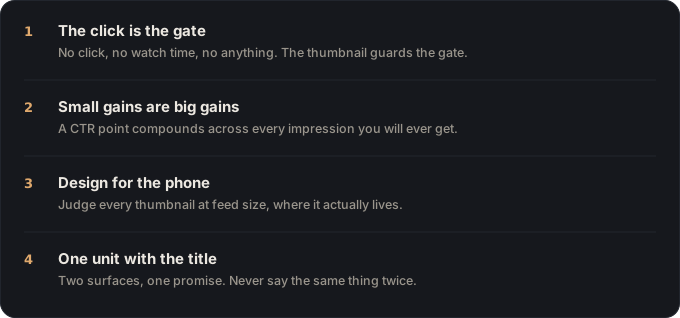
YouTube shows your thumbnail and title to a small slice of potential viewers first, in the home feed, in suggested, in search. What that slice does decides everything that follows. Enough of them click, and YouTube widens the circle. They scroll past, and it quietly stops showing your video. Watch time, subscribers, “getting picked up by the algorithm”: none of it starts until the click does.
The metric for that decision is click-through rate (CTR): the share of people who clicked after seeing your thumbnail. According to YouTube, most channels live in a fairly narrow band: half of a channel’s videos have an impressions CTR between 2% and 10%. That sounds small. It isn’t.
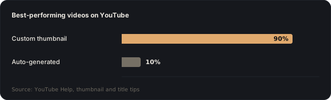
90% of the best-performing videos on YouTube use a custom thumbnail.
YouTube Help, Add video thumbnails
The auto-generated frame YouTube grabs for you is what the other 10% look like. A custom thumbnail isn’t a nice-to-have polish step. By the platform’s own numbers, it’s what almost every video that works has in common.
Why small gains are big gains
Here’s the part creators underrate. Picture two identical videos, same title, same content, where one lands a 4% CTR and the other 8%. The second doesn’t get twice the views. It gets many times more.
That’s because CTR isn’t a one-time toll; it’s a feedback loop. A higher click rate on the first small audience tells YouTube “show this to more people,” which produces more clicks, which earns a still-bigger audience. A one-point improvement you’d never notice in isolation compounds every time the video is served. It’s how two channels with equally good videos end up an order of magnitude apart, and the gap often started at the thumbnail.
Design for the phone, and for the ten-foot TV
Two facts set your thumbnail’s real conditions. Around 69% of YouTube views happen on mobile: most click decisions are made at phone size, a couple of centimetres wide, stacked against a dozen rivals. And since December 2024, the TV is the number one US device by watch time, per YouTube’s own CEO letter: over a billion hours a day now play on a screen judged from across a room.
Everything in this module comes back to that double reality: a thumbnail has to work small and read at a distance. The good news is that the same moves win both, because bold, simple, high-contrast design is what survives a two-centimetre render and a ten-foot glance alike. A thumbnail that’s stunning at full size on your monitor and unreadable everywhere else is a thumbnail that loses.
The thumbnail and title are one unit
One last shift before the how. A viewer never sees your thumbnail alone. They see it welded to your title, for a fraction of a second, in a crowded feed. The two either say the same thing twice (a wasted slot) or they combine into something bigger than either: a promise, a question, a gap the video pays off.
Design them together. If the title says “I tried it for 30 days,” the thumbnail shouldn’t also say “30 days”; it should show the result those 30 days produced. Title and thumbnail are one message split across two slots.
What this module does
The rest is the practical how: the 3-second rule, faces and contrast, how much text, and how to test. None of it is about making “pretty” thumbnails. It’s about making clear ones that win the click your video already deserves.
🎬 Video script
- Cold open: “This is the most expensive mistake I see creators make.” (screen: a genuinely great video wearing a lazy auto-grabbed frame)
- The click-is-the-gate idea, then land the 90% stat on screen as a full-frame graphic.
- The two-identical-videos example, animate 4% vs 8% snowballing into wildly different view counts.
- Hold up a phone: “This is the actual size you’re designing for.” Show a thumbnail in a real mobile feed.
- Title + thumbnail as one unit, two feed mockups, one redundant, one that combines.
- Close: “Get this right and everything else gets easier. Next lesson: the 3-second rule.”
Sources
- YouTube Help, Add video thumbnails (“90% of the best-performing videos… have custom thumbnails”).
- YouTube Help, Measure your click-through rate (typical 2, 10% CTR range).
- Advanced Television, 69% of YouTube viewership on mobile devices (2025).
- YouTube Blog, Our big bets for 2025: TV overtook mobile as the primary US device by watch time (Dec 2024); 1B+ hours daily on TVs.
Key takeaways
- Click-through rate is the gate, no clicks, no views, no matter how good the video is.
- 90% of the best-performing videos on YouTube use a custom thumbnail, that's YouTube's own data.
- Most channels sit between a 2% and 10% CTR; small, consistent gains compound through the algorithm.
- Your thumbnail and title are one unit, design them together, never separately.