Titles & packaging · Lesson 2
Titles and thumbnails are one unit
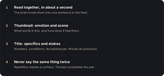
Viewers read the thumbnail and title as one sentence, in about a second. Design the pair, not the parts.
Nobody reads your title on its own. In the feed, the eye lands on the thumbnail first, the title a beat later, and the brain fuses them into a single impression: one sentence, read in about a second, that either opens a question worth clicking or doesn’t. Yet most creators make them separately: the thumbnail in a design tool on Tuesday, the title in the upload form on Friday, each one trying to do the whole job alone.
That’s the core mistake this lesson removes. You are not designing a thumbnail and writing a title. You are making one promise across two surfaces.
The pair is the click decision
YouTube is unambiguous about how much this pairing carries:
90% of the best-performing videos on YouTube have custom thumbnails.
YouTube Help, “Thumbnail & title tips”
The same official guidance treats the two as a unit: its checklist asks whether your thumbnail and title work together to tell a story, not whether each is individually pretty. The platform’s A/B testing tool tests them as combinations for the same reason: viewers never experience them apart.
Divide the labor
Two surfaces means you get to say two things, as long as each surface does the job it’s best at.
The thumbnail carries emotion and scene. It answers, at a glance and at small size: what world am I entering, and how does it feel there? A face mid-reaction, a result held up to camera, a before/after: imagery does this in milliseconds, and faces and contrast do it best. What imagery does badly is specifics: numbers, conditions, stakes.
The title carries specifics and stakes. Words are precise. “I tested it for 30 days,” “under $100,” “before you buy one”. That’s title territory. The title takes the feeling the thumbnail created and sharpens it into the exact deal from the last lesson: outcome, stakes, addressee.
The division gives you a mechanical rule that’s easy to apply at upload time: don’t say the same thing twice. If your thumbnail shows a cracked workbench and your title says “My workbench cracked,” the pair has used two surfaces to make half a promise. Let the thumbnail show the crack; let the title raise the question the image can’t: “The mistake that ruins most first workbenches.”
Complete each other, don’t compete
The strongest pairs run a call-and-response. The thumbnail opens a gap: something surprising, unresolved, mid-motion. The title aims that gap at you: names the stakes, the timeframe, the person it’s for. Together they form a sentence neither could form alone.
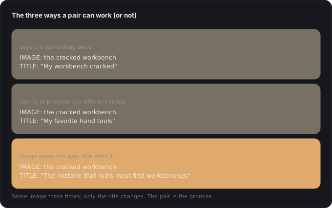
Two failure smells to check for. Redundancy: the title captions the image (you’ve wasted a surface). Divergence: the title and image seem to promise different videos (the viewer’s fused first impression is confusion, and confusion never clicks). You’re aiming for the third thing: tension. Image raises the question; words make it personal.
There’s a trust dimension too. Whatever the pair promises together is what the video owes: a thumbnail that over-promises breaks the contract even when the title was honest, and the algorithm reads the early abandonment that follows exactly as if the title had lied. The next lesson covers where that line sits.
Make them together
The workflow fix is the same one as the last lesson, extended: don’t write the title and design the thumbnail in different weeks. Sketch them as a pair, ideally before you shoot, even a rough “image shows X, title says Y” note is enough to expose redundancy while it’s still free to fix. When you shoot, you’ll grab the frame the thumbnail needs on purpose instead of hunting for it in the edit.
The one-unit check
- Seen side by side at feed size, the thumbnail and title read as one sentence.
- The thumbnail carries a feeling or scene; the title carries the specifics and stakes, no overlap.
- The title doesn’t repeat anything visible in the image.
- The two don’t suggest different videos.
- The pair’s combined promise is one the video actually keeps.
🎬 Video script
- Open on a feed mock-up. Cover the thumbnail with your hand: “Would anyone click this title alone?” Then cover the title: “Or this image alone?” That’s the point.
- Show YouTube’s 90% custom-thumbnail stat, then its own checklist language: “work together.”
- Demonstrate the division of labor with one video packaged three ways: redundant, divergent, and call-and-response.
- Rebuild a real pair live: strip the caption-title, move emotion into the image, specifics into the words.
- Close: “One promise, two surfaces. Make them in the same sitting.”
Sources
- YouTube Help, Thumbnail & title tips: the 90% custom-thumbnail figure, and YouTube’s guidance to make thumbnails and titles work together.
- YouTube Help, A/B test titles & thumbnails: the platform tests packaging as title/thumbnail combinations, not parts.
Key takeaways
- The thumbnail and title are read together, as one promise, design them as a pair.
- Divide the labor, the thumbnail carries emotion and scene, the title carries specifics and stakes.
- If the title repeats what the thumbnail already shows, one of them is wasted.