Thumbnails that get the click · Lesson 4
Text on thumbnails: less is more
The word-count ceiling, what the text should say that the title doesn't, and the legibility rules that decide whether anyone reads it.
New creators treat the thumbnail like a second title bar, cramming in a sentence as if more words mean more clarity. The opposite is true. Thumbnail text isn’t read, it’s glanced at, and a glance registers a word or two, never a sentence. Every word past that is invisible at best, clutter at worst.
YouTube’s own guidance is blunt about it: keep it short and make it legible.
Text on a thumbnail is scanned in the same fraction of a second a viewer spends deciding to click. Reading takes longer than they’ll give you.
The three-to-four-word ceiling
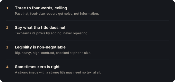
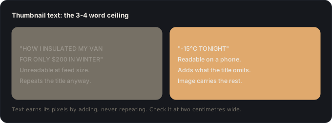
Treat three to four words as a hard ceiling, not a target. That’s roughly all a viewer can register in the instant they decide whether to click. Anything longer gets skipped, because scanning is all a feed thumbnail gets.
If you’re writing “I tried the world’s hardest workout for 30 days,” you don’t have a caption, you have a title. Put it in the title field, where YouTube gives you the space and the reading time to use it. The thumbnail’s text should be a single spike of specificity that lands after the image has communicated the subject: “FAILED,” “3 YEARS LATER,” “IT WORKED,” “$0 BUDGET.” A jolt, not a summary.
Say what the title doesn’t
The biggest waste of thumbnail text is restating the title. If the title is “I Tried the World’s Hardest Workout for 30 Days” and the thumbnail says “30 DAY WORKOUT,” you’ve spent your three words repeating what the viewer already read.
The title and the text should divide the labour. The title sets up the premise, what you did. The thumbnail delivers the hook the title withholds, what happened. “30 DAYS” is redundant. “I QUIT” or “+15 LBS” is a new, specific claim that makes the viewer want the details. Gut check: read your title out loud, then your thumbnail text right after. If the second line tells you nothing the first didn’t, cut it or replace it.
Legibility rules
Text that can’t be read at thumbnail size doesn’t exist, however good the copy is. Four rules hold up across every style:
- Size it huge. If it looks oversized on your monitor, it’s about right at real scale.
- Go heavy. Bold, thick weights survive shrinking. Thin fonts vanish first.
- Extreme contrast. A dark outline or drop shadow on light text, so it holds up over a busy background.
- A clear zone. Bottom third, or any flat area, never over a face or texture it has to fight.
None of these are style preferences. They’re the difference between text that survives 120 pixels and text that turns to smear.
When to use no text at all
Text is a tool, not a rule, and some of the strongest thumbnails carry none. If the image alone, a face mid-reaction, a dramatic before-and-after, a striking result, already reads in three seconds, words on top just clutter a frame that was working. This is especially true once your channel has a consistent look and viewers read the image without a caption to prime them.
A good default: build the image first, run the 3-second test with no text, and add words only if it fails without them. Not as a reflex on every upload.
🎬 Video script
- Cold open: a sentence-long caption vs a clean three-word one. “Which one did you actually read?”
- The three-to-four-word ceiling, with real spike-word examples (FAILED, IT WORKED, $0 BUDGET).
- The title-vs-text redundancy test, both read out loud on screen.
- Live legibility pass on a thumbnail: size, weight, contrast, placement.
- Close: show a strong no-text thumbnail and explain why it didn’t need words. “Next: how to know if any of this actually worked.”
Sources
- YouTube Help, Thumbnail & title tips (keep text short and legible; clarity first).
- Advanced Television, 69% of YouTube viewership on mobile (why text has to survive tiny render sizes).
Key takeaways
- Three to four words maximum. The title carries the rest.
- Thumbnail text should add a NEW idea, not repeat the title.
- Huge, high-contrast, in a clear zone, legible at 120px or cut it.