Free LUTs · travel · airy · daylight
Calm Blue
Luminous blue-green daylight: the colour lives in the shade and the whites stay pure, which is what makes it read bright rather than filtered.
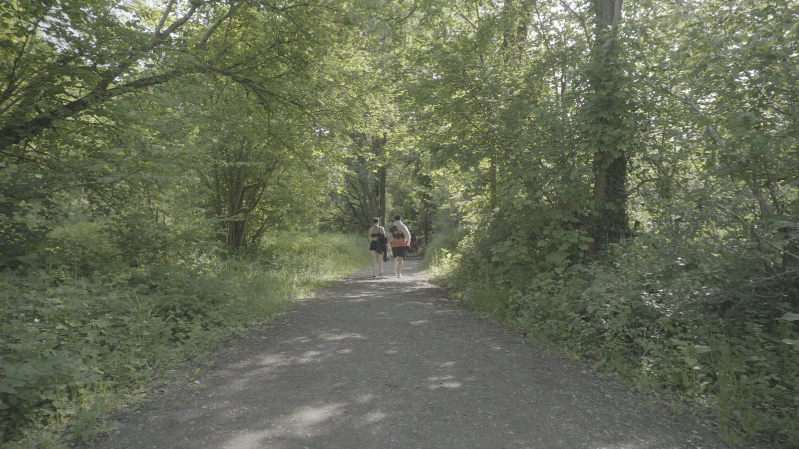
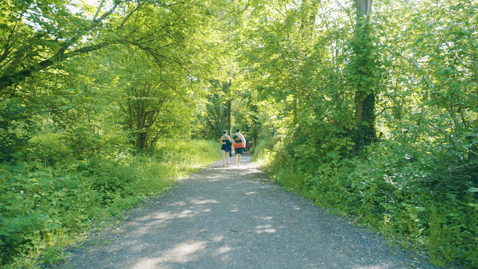
Calm Blue is built backwards from a normal film look, and that inversion is the whole point. Most looks tint the highlights and drain the shadows; this one puts the colour in the dark and keeps the whites pure. That is what makes a frame read luminous instead of filtered: bright clean highlights sitting against richly coloured shade.
It came out of measuring a photograph whose palette was worth stealing (the measurements, not the pixels: a look is not copyrightable, a file is). The targets it chases are its shadows at high saturation, its whites near neutral, a cyan bias through every tonal zone, and nothing clipped at either end. Getting there took two guards that turned out to matter more than the look itself: sand, dry grass and concrete carry so little colour that any cast swings their hue wildly, so they are held at their own warmth, and skin is locked separately.
Two honest notes. It wants frames with real shade in them, because the colour needs somewhere to live: a canopy, an interior, deep water. On a flat hazy scene it will look pleasant but cannot invent depth the camera never captured. And what reads as "clean detail" is partly tonal separation, which this supplies, and partly edge sharpness, which no LUT can produce. A little Midtone Detail after it finishes the job.
Get Calm Blue, and everything else
Pick the version that matches how you shoot and get every look in one zip, each file already correct for your footage, plus the license and a one-page install guide for Resolve, Premiere, Final Cut and CapCut.
Also in the pack
- SoraThe house signature: turquoise-leaning skies that keep their gradient, warm red mids under cold whites, skin that stays skin.
- Retro Surf70s-postcard: a cool turquoise world with warmth laid only on people and whites, pink clouds over a cyan sky.
- Horror GreenA corridor drowned in sick emerald, with the practical lights still glowing white. Your exposure untouched.
- Horror BlueThe same dread in steel: a corridor flooded with deep blue, the lamp still burning white.
- VinlandThe elf-world grade: gold in the highlights, a warm floor so nothing is ever black, dirt trails a proper brown, greens vivid and luminous, skies a light pastel blue.
- PanelkaThe cold one: blacks that actually reach black, a grey-blue floor, deep skies, and colour held on a leash so a shop sign cannot shout over the concrete.
- RoninBlack and white the way film did it: a red-weighted channel mix, so skies go dark, foliage drops away and skin stays bright and smooth. Not a saturation slider at zero.