Free LUTs · night · cold
Horror Blue
The same dread in steel: a corridor flooded with deep blue, the lamp still burning white.
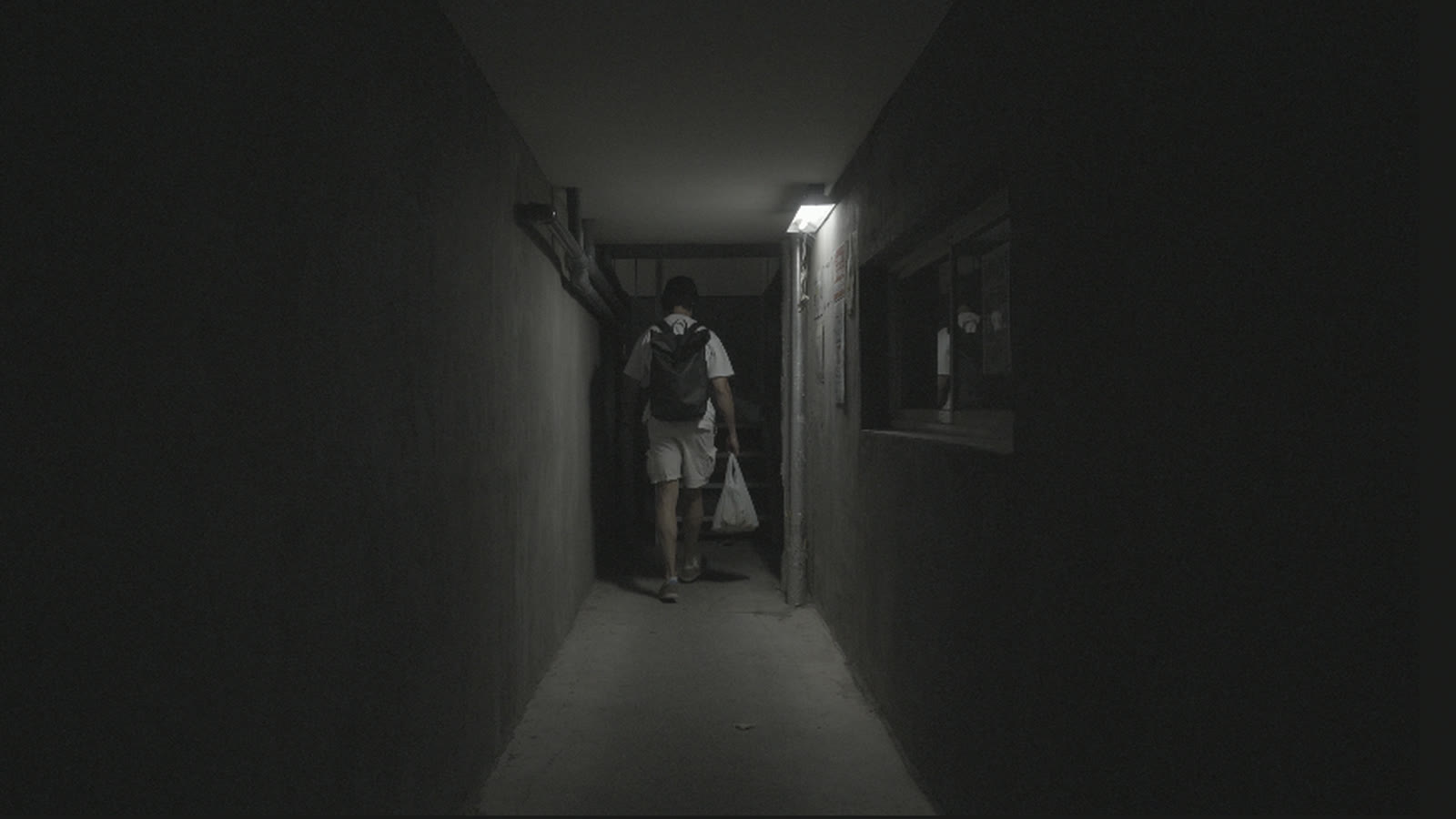
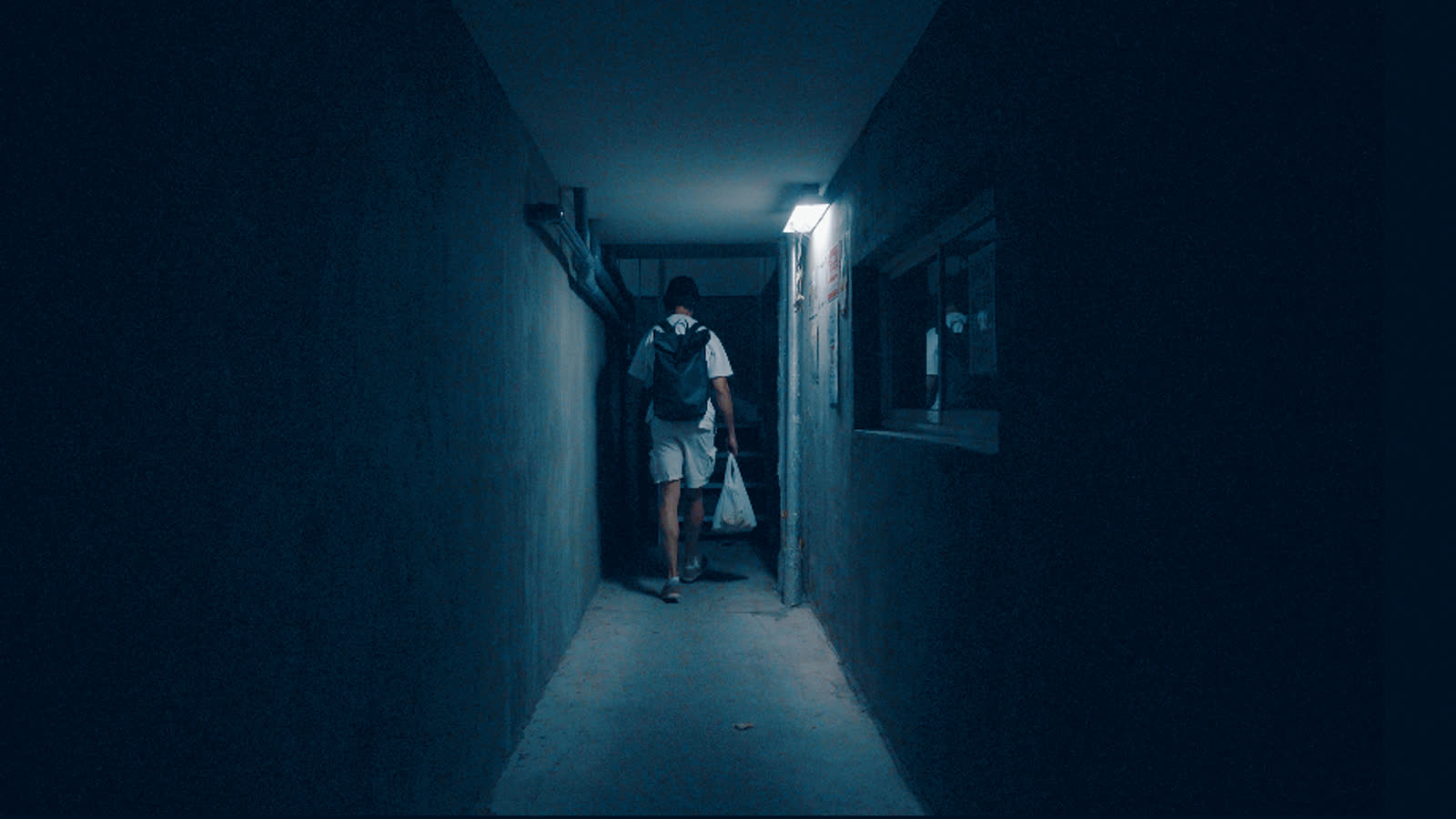
How Horror Blue was built
Horror Blue is Horror Green with one decision changed: the colour poured into the dark slides from emerald to steel blue, moonlight instead of tube-light. Everything that makes the green version safe on real footage carries over unchanged: the same exposure, the same protection for whites and practicals, the same pastel roll-off that keeps it from going garish, and the same restraint on reds, which keep their colour without shouting over the cold.
Pick between the two by your light source rather than your genre. Practical and fluorescent scenes lean Green, ambient night exteriors lean Blue. Both ship in the pack, so audition them on the actual clip.
Get Horror Blue, and everything else
Pick the version that matches how you shoot and get every look in one zip, each file already correct for your footage, plus the license and a one-page install guide for Resolve, Premiere, Final Cut and CapCut.
While it downloads
The look is the last 5% of a video people finish.
A LUT makes footage look good. Whether anyone watches to the end comes from what you shoot and how you tell it. Two free places to start, no signup:
Want the whole team behind your next video? See what Vanpelt Studio does →
Also in the pack
Sora
The house signature: turquoise-leaning skies that keep their gradient, warm red mids under cold whites, skin that stays skin.Retro Surf
70s-postcard: a cool turquoise world with warmth laid only on people and whites, pink clouds over a cyan sky.Horror Green
A corridor drowned in sick emerald, with the practical lights still glowing white. Your exposure untouched.Vinland
The elf-world grade: gold in the highlights, a warm floor so nothing is ever black, dirt trails a proper brown, greens vivid and luminous, skies a light pastel blue.Panelka
The cold one: blacks that actually reach black, a grey-blue floor, deep skies, and colour held on a leash so a shop sign cannot shout over the concrete.Ronin
Black and white the way film did it: a red-weighted channel mix, so skies go dark, foliage drops away and skin stays bright and smooth. Not a saturation slider at zero.Calm Blue
Luminous blue-green daylight: the colour lives in the shade and the whites stay pure, which is what makes it read bright rather than filtered.Bold Cinema
Teal-orange with deep blacks: the world goes teal and dense while skin stays bright and natural, not orange plastic.Matcha
A lush jade-and-lime world: greens that deepen in the shade and glow in the sun, green-black shadows, a matte pale-mint top, skin kept human.