Retention & pacing · Lesson 1
How to read your retention graph
The four features of every retention curve, what each one is actually telling you, and the discipline of diagnosing before you change anything.
Most creators look at their retention graph the way you’d look at a bad grade: a single number, a wince, close the tab. Which is a waste, because the retention curve is the only place YouTube shows you, minute by minute, exactly where your video worked and where it lost people. It’s not a grade. It’s a map of your storytelling with the failures marked in red.
What does a retention graph mean, feature by feature? Reading it takes about four minutes once you know the four labels, and YouTube’s own analytics names them:
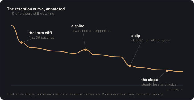
The key moments report labels your curve: the Intro (the share still watching after the first 30 seconds), Top moments (stretches where almost no one left), Spikes (points that were rewatched or shared), and Dips (moments that were skipped, or where viewers stopped watching entirely).
YouTube Help, “Measure key moments for audience retention”
Here’s what each one is telling you, and (more important) which lesson of this course fixes it.
The intro cliff
Every curve starts with a drop in the first 30 seconds; the question is only how steep. A brutal cliff has two usual causes, and they’re diagnosable: if the click-through rate was high and the cliff is steep, the packaging promised something the opening didn’t start delivering, a broken promise, fix the alignment. If CTR was modest and the cliff is steep anyway, the opening itself is slow: throat-clearing before the content. Either way the cliff is a packaging-and-hook problem, not a “my video is bad” problem.
A third reading is worth adding: a strong first three seconds followed by a cliff before forty-five is a different animal again. The packaging worked and the opening worked; what failed is everything after the first line. The Hook Book covers that stretch specifically.
The slope
After the cliff, healthy retention is a gentle downward slope: some loss per minute is physics, not failure. What you’re reading for is the steepness between features: a stretch that sheds viewers faster than the video’s average is a pacing problem even if no single moment dips, usually a segment where no question is open, so every second is an acceptable exit. The slope is where pacing lives.
Spikes
Spikes mean rewatching or skipping to: viewers found something worth seeing twice, or scrubbed forward to the anticipated payoff. Both are gold: they tell you what your audience actually came for. The diagnostic question for every spike: could the video have gotten here sooner, or promised this moment harder up front? Spikes are your next video’s thumbnail and title material, found empirically.
Dips
A dip is a specific moment that made people skip or leave, and its timestamp is an accusation: go watch those exact 30 seconds and you’ll almost always find one of a small set of culprits, a digression from the promised question, a repeated point, an over-long transition, the mid-video slump, or a payoff that was never set up and so landed flat. The dip names the beat that failed; the fix happens in the next video’s structure.
The two disciplines
Compare your own shapes, not others’ numbers. Absolute retention varies wildly with video length, niche, and audience: the report itself needs only 100 views to appear, and small-sample curves are noisy. The signal is in shape differences across your own videos: this open held 80% where that one held 60%; this format’s slope is gentler. Your channel is the only valid benchmark you have.
Diagnose before you change. The graph is only useful next to the video’s structure. Line the curve up against your beat sheet and every feature acquires a name: the dip is beat 3 running long, the spike is the payoff of the setup in minute two. Retention review without the beat sheet produces vibes; with it, it produces next-video decisions.
The graph-reading check
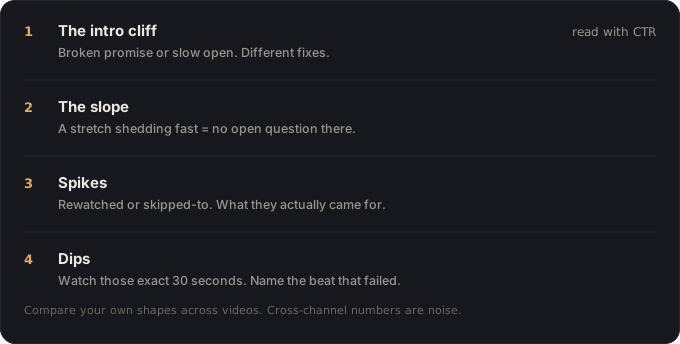
- Intro cliff read with CTR: broken promise vs slow open, different fixes.
- Slope checked between features for the segment shedding faster than average.
- Every spike answered: could we get here sooner, or promise it harder?
- Every dip’s timestamp watched and named against the beat sheet.
- Conclusions written as next-video changes, not as a grade.
🎬 Video script
- Open on a real retention curve, no commentary: then annotate its four features live: “The graph already wrote the review. Learn to read it.”
- Put YouTube’s own four labels on screen; this isn’t folklore, it’s the report’s vocabulary.
- Walk one cliff diagnosis with CTR context: broken promise vs slow open, different fixes.
- Line the curve against the beat sheet and name a dip after its failing beat.
- Close: “Your channel is the benchmark. The shape is the signal. Diagnose, then shoot the fix into the next video.”
Sources
- YouTube Help, Measure key moments for audience retention: the report’s four labels, the intro metric, and the 60-second/100-view thresholds.
- YouTube Help, Impressions & click-through-rate FAQs: reading CTR alongside retention for the cliff diagnosis.
Key takeaways
- The retention graph has four features (intro cliff, slope, spikes, dips) and each points at a different fix.
- Compare shapes across your videos, not absolute numbers against other channels.
- Diagnose against the video's structure; a dip's timestamp names the beat that failed.